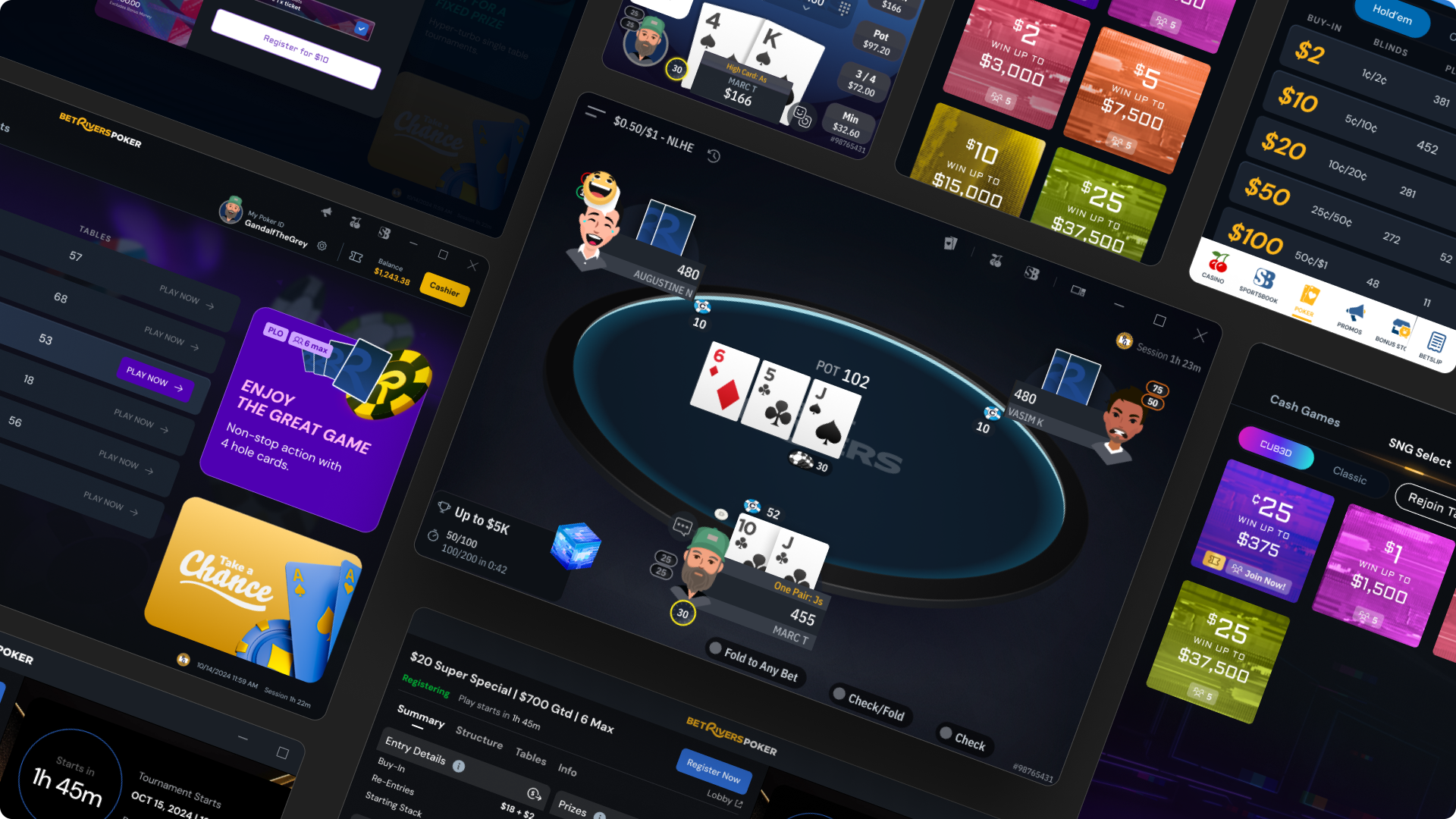
♠️ BetRivers Poker - App for Rush Street Interactive
Rush Street Interactive
2 years
4 Product Designers, 1 Product DIrector, 1 QA, 1 PM, Dev Team
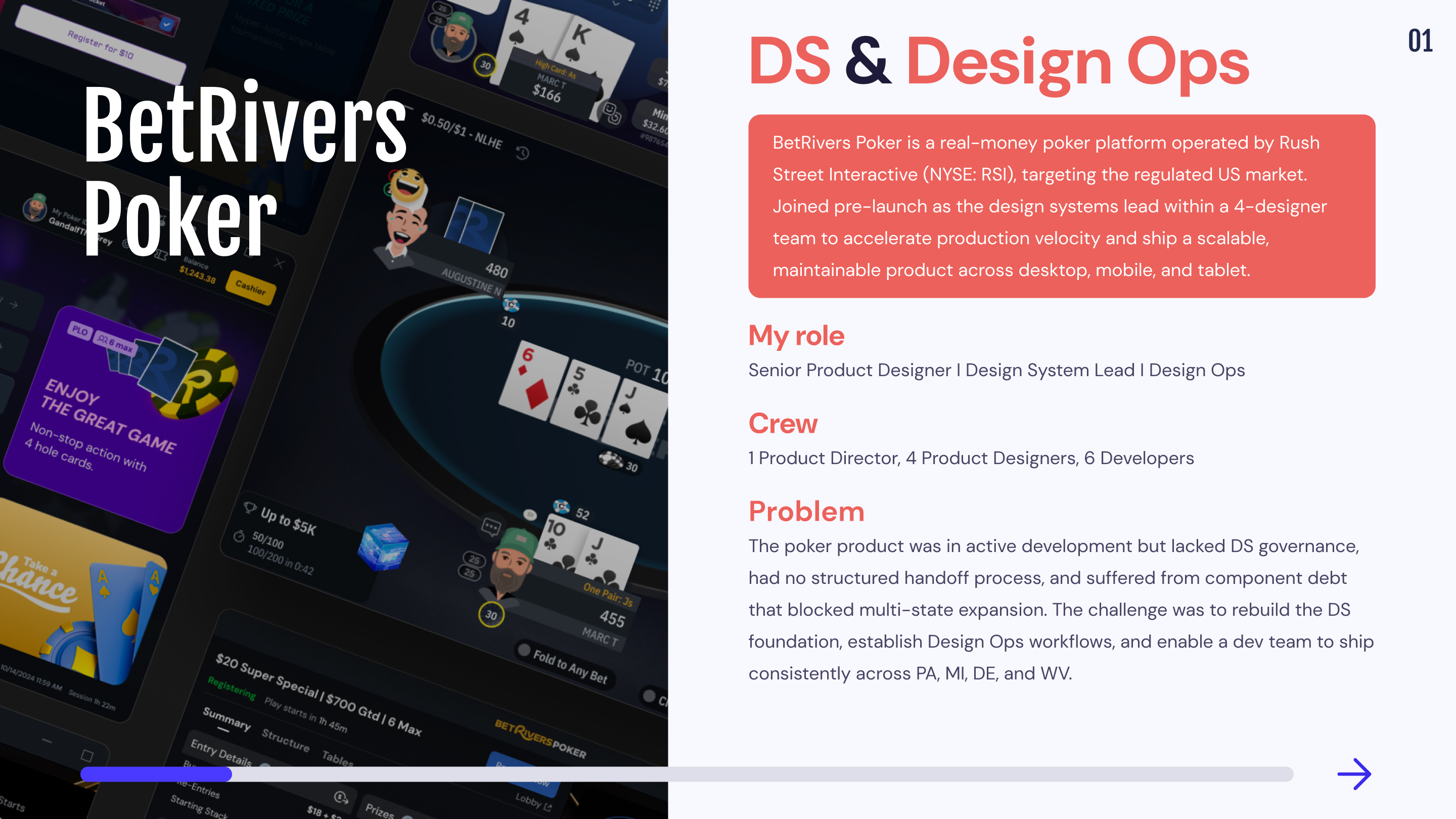
iGaming App
Optimize the Design System and workflow processes to accelerate production velocity, improve design consistency across platforms, and streamline the handoff between design and development.
Remote from Bangkok (GMT+7) with structured async handoff across EU timezone.
Mission 1 : Design Ops & Design System
When I joined the BetRivers Poker team, a significant part of the product was already built, but the design debt was massive. There were outdated and unlinked styles, accessibility issues, no naming conventions, many broken components, and no clear process for component creation or validation.
Another key challenge was the lack of integration with the company’s global design system. Designers had created components based solely on their immediate needs, without optimizing communication with the DS lead. This resulted in heavy, unmanageable files, unclear differentiation between exploratory designs and reusable components, and a lack of alignment on our foundations.
🕵️♂️ Our Organization
BetRivers Poker is part of Rush Street Interactive (RSI), which also includes two other teams: Sportsbook and Online Casino. These teams are directly connected to RSI’s global Design System, ensuring consistency across their platforms.
However, our Poker team had specific needs that required a separate Design System. We needed:
By developing our own Poker Design System, the idea was to optimized production velocity, streamlined handoff, and created an agile design workflow tailored to our product’s unique requirements.
🗃️ Folders presentation
The BetRivers Design System is composed of 5 main folders and I participated in their construction :
1.🕵️♂️ Ds Ops
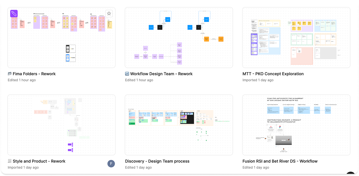
This folder contains files used to improve our work processes.
📁 Workflow Design Team
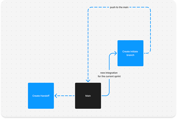
The purpose of this file was to review and optimize our processes for handoff creation, initiating design explorations, integrating new features into existing designs, and managing the archiving process efficiently.
📂 Fima Folders - Rework
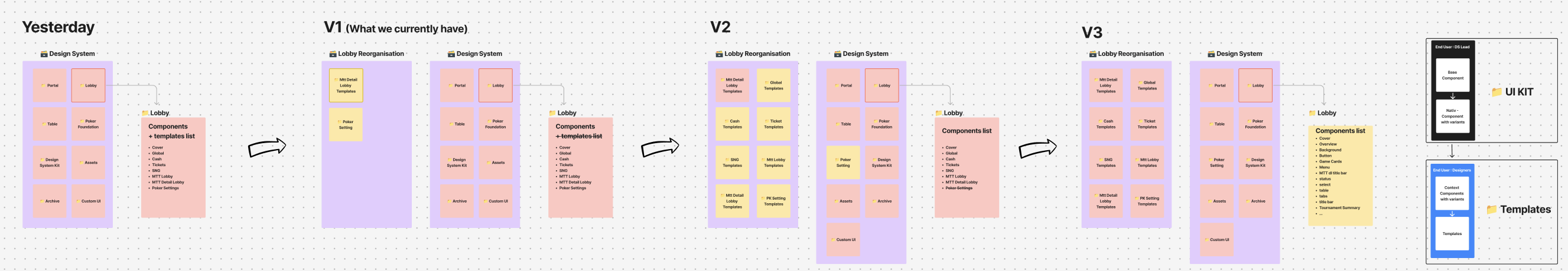
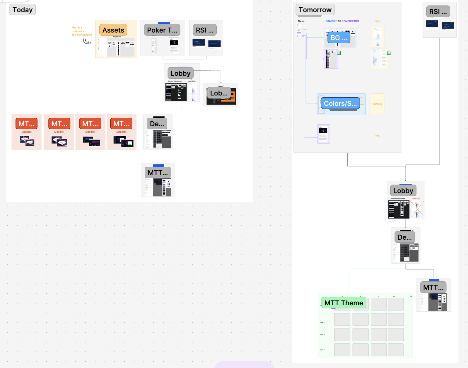
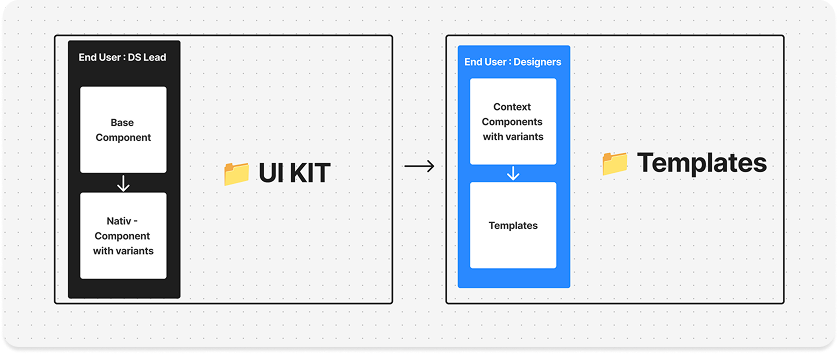
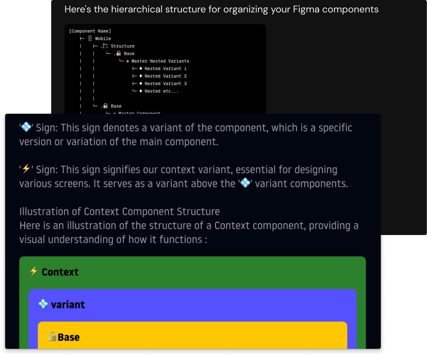
This file aimed to restructure our Figma organization, separating the UI kit (the single source of truth for components) from templates used by product designers. The challenge was to allow designers to customize components for interface building without breaking the UI kit. This led to the introduction of contextual components, a concept we plan to revisit later.
📂 Style and Product - Rework
This file aimed to refine content organization by improving categorization and grouping of styles and components while identifying missing items to ensure better structure and clarity.
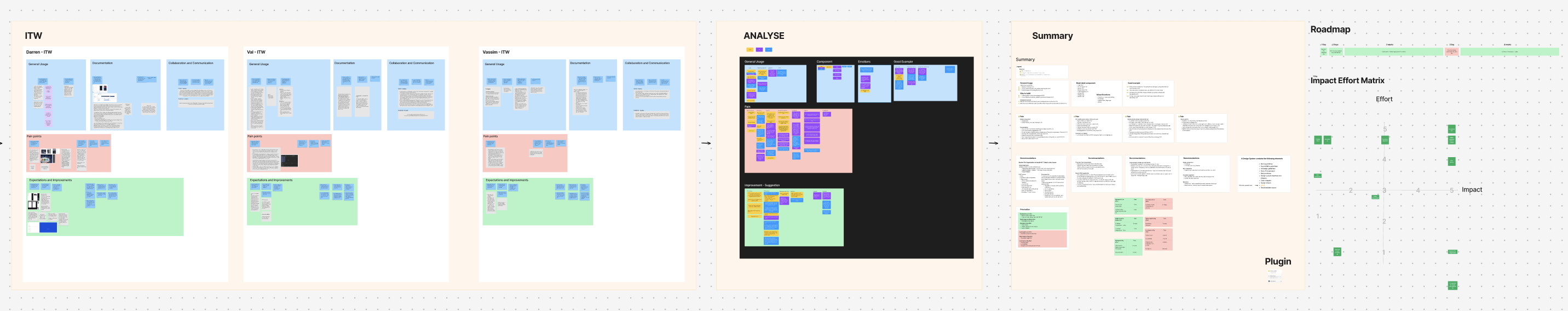
📂 Discovery - Design Team process
This file aimed to audit our current organization and assess how the product design team used, documented, and collaborated within our files. It identified pain points and improvement expectations from team members. Based on these insights, I created an impact-effort matrix to prioritize solutions and define a clear roadmap for optimization.
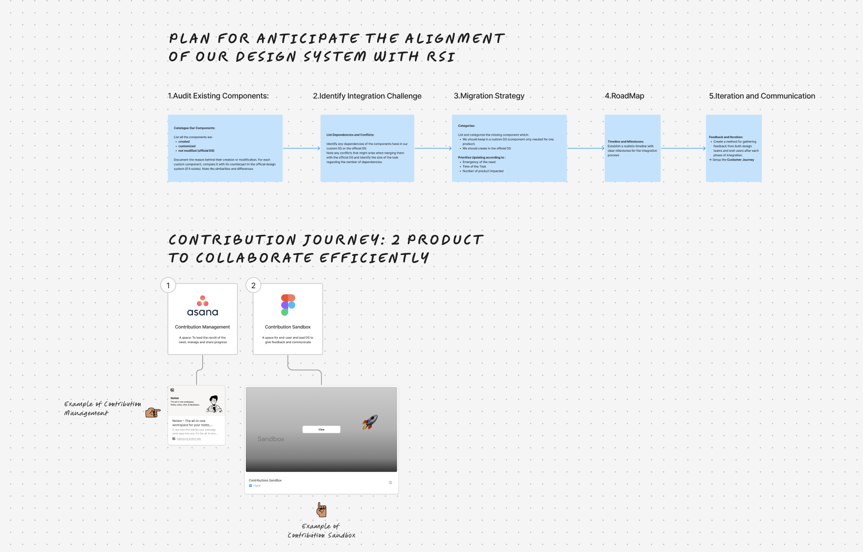
📂 Fusion RSI and Bet River DS - Workflow
The aim of this project was to build a plan to help better integrate our Ecosystem within RSI DS.
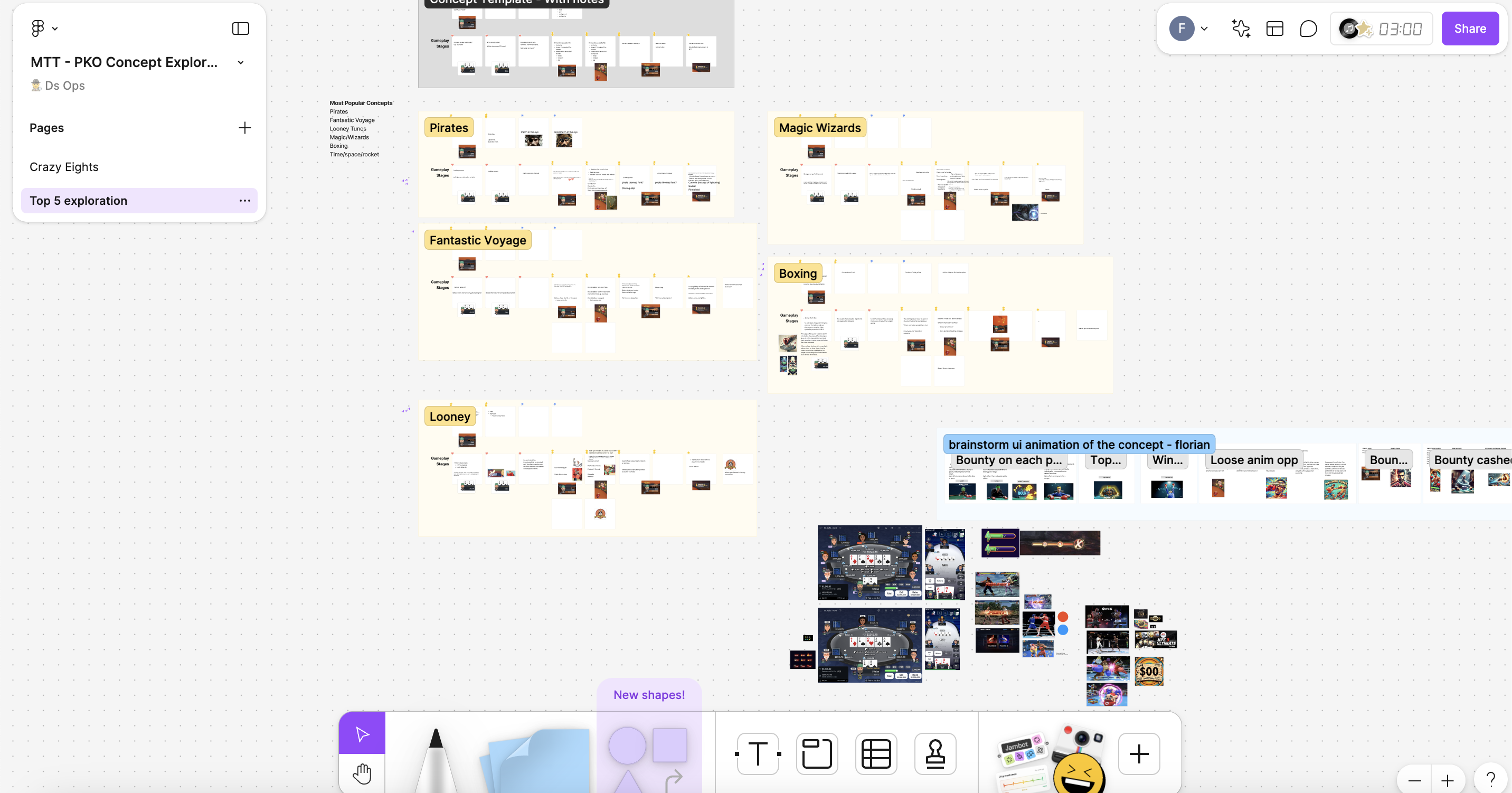
📂 MTT - PKO Concept Exploration
This file aimed to explore new design approaches for the Knockout tournament theme using a Crazy 8 ideation session to generate innovative feature concepts.
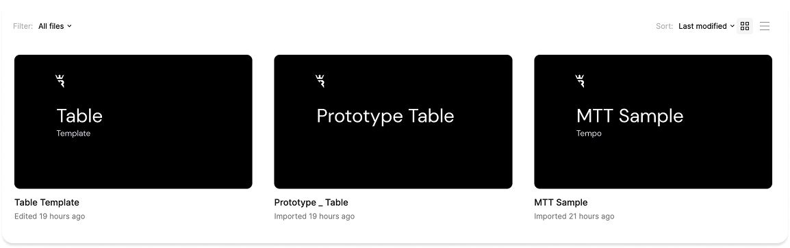
2.🕹️ Samples
This folder contains files that showcase component interactions, helping product designers and developers better understand their behavior. It also provides an overview of all style combinations, as our game offers multiple customization options for its appearance.
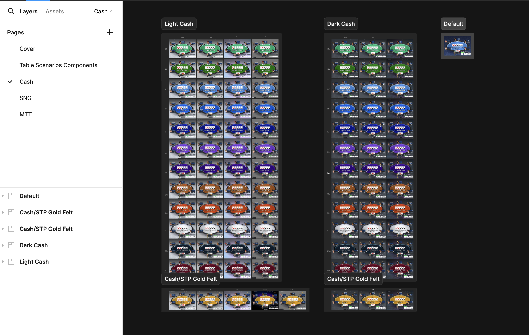
📁 Table
This file is dedicated to representing the different styles available for the table's appearance.
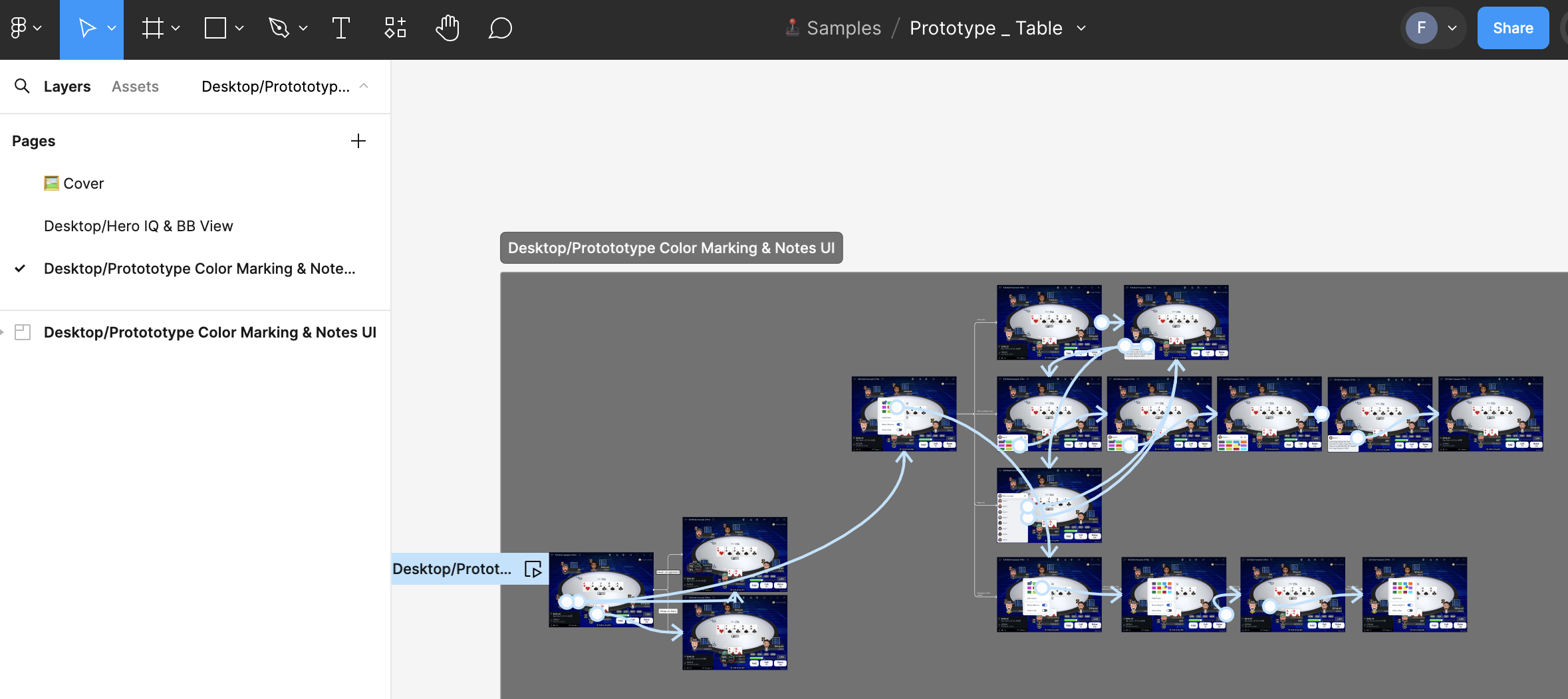
📁 Prototype Table
For optimization reasons, a separate file is necessary when adding multiple interactions to illustrate various features within the same prototype. Including them directly in other files would make them too heavy, as those files are focused on isolating and presenting individual features.
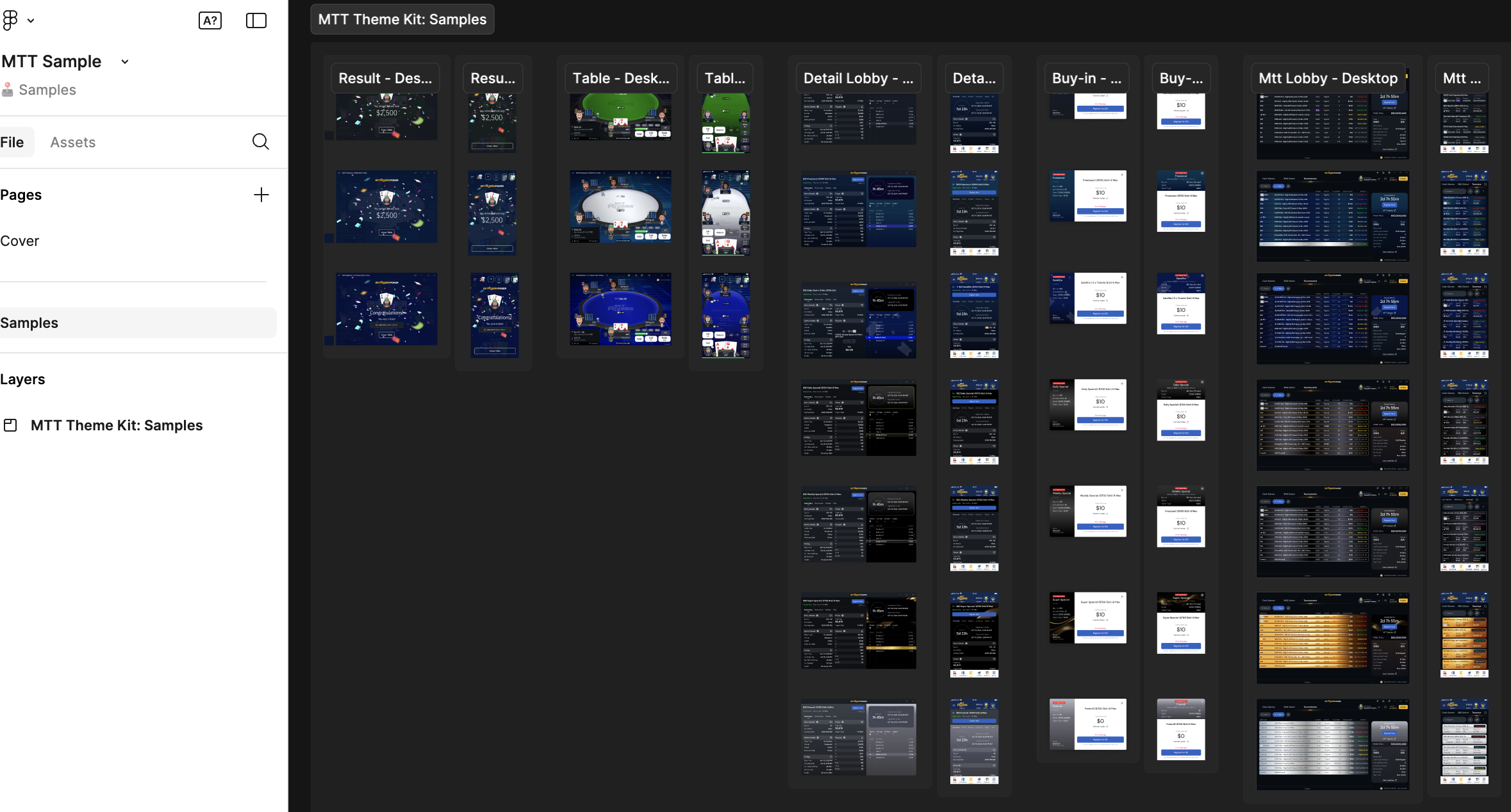
📁 MTT Sample
This file is dedicated to representing the different styles available for the MTT appearance on the different areas (Table,Mtt Lobby,Mtt Dt Lobby,Result,Buy-In)
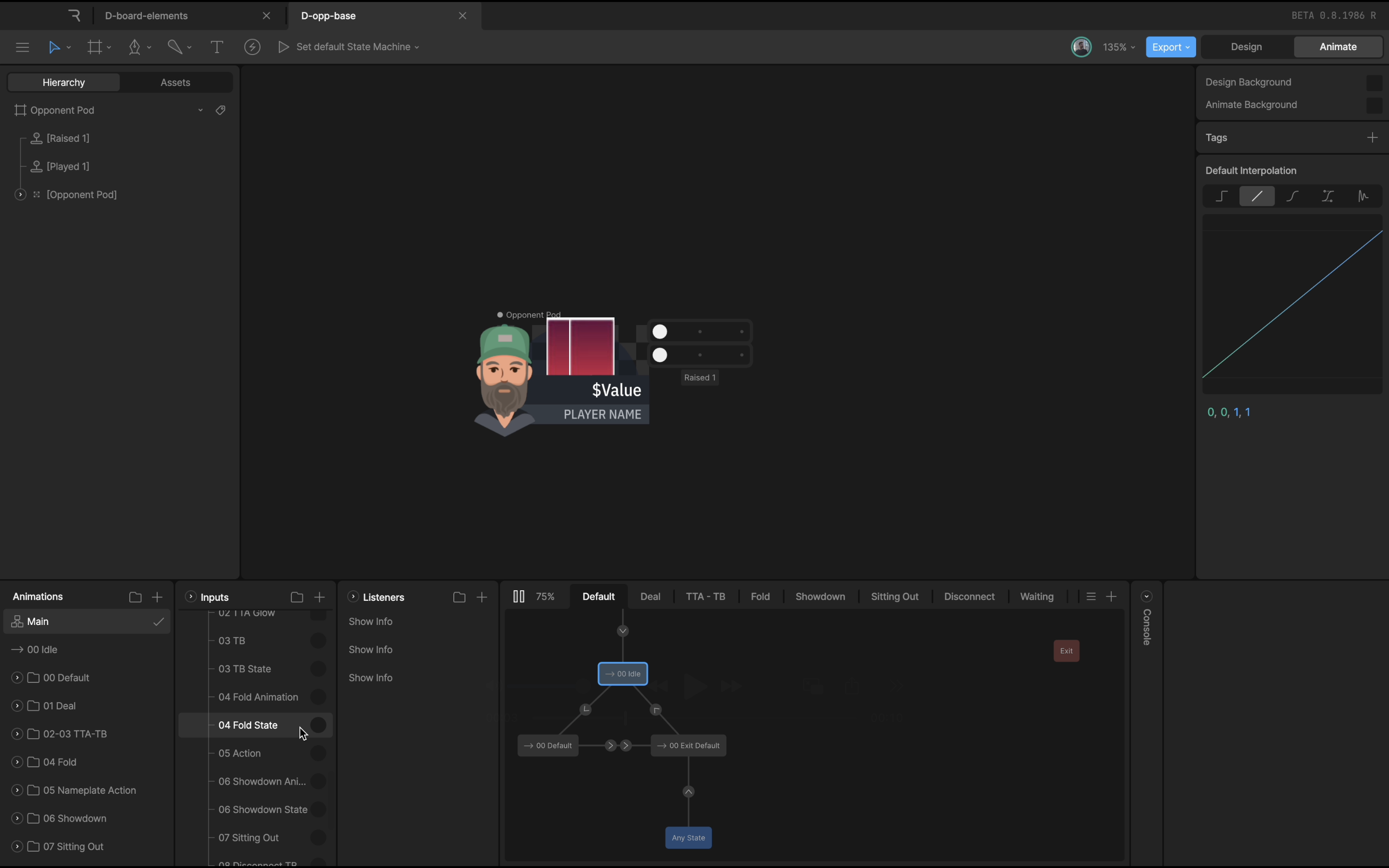
3.🎨 Design
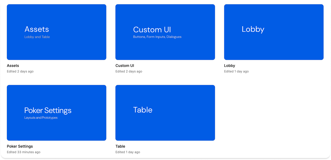
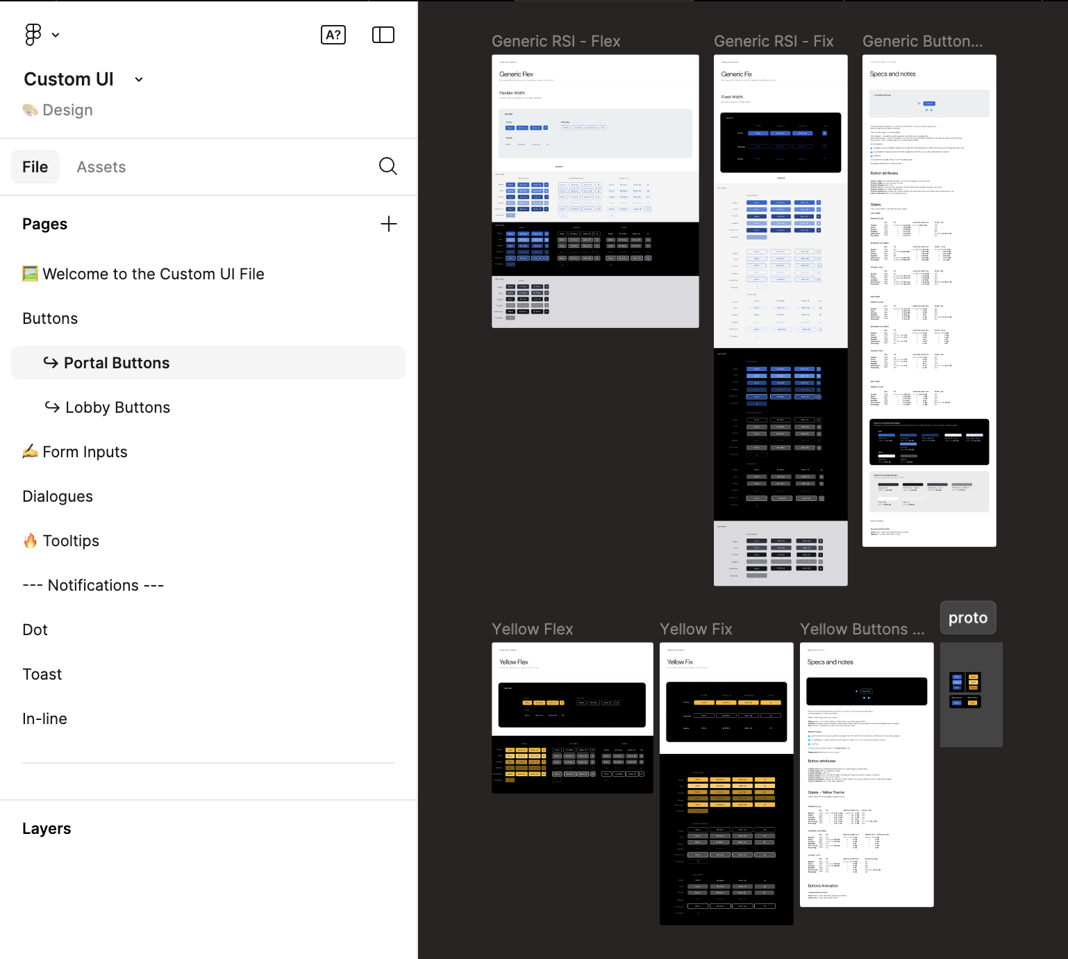
This folder contains our UI Kit components and Foundations, essential for building all our poker products and serving as the single source of truth. I am responsible for their maintenance and functionality. The components are organized into 5 distinct areas for better structure and usability.
📁 Table
This file is dedicated to both basic and complex components for the table area. Each page includes its own specifications and a dedicated prototype to illustrate its features.
📁 Lobby
This file is dedicated to both basic and complex components for the lobby area. Each page includes its own specifications and a dedicated prototype to illustrate its features.
📁 Custom UI
This file contains custom atomic components (different from RSI DS) that are used throughout our application.
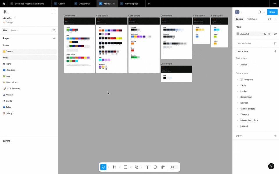
📁 Assets
This file contains all our foundations (color,fonts,icon,img,illustrations,logo)
📁 Poker Settings
This file is dedicated to both basic and complex components for the poker setting area. Each page includes its own specifications and a dedicated prototype to illustrate its features.
4.📚 Documentation
This folder contains files that define and summarize our app’s various interactions and main specifications. It also includes our design kit for building different legends in our Figma file, along with our guidelines on naming conventions, file structure, and contribution process.
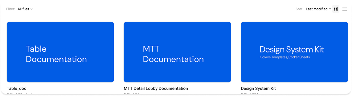
📁 Table Documentation
This file is dedicated to summarize our main spec and interactions on our Table for mobile and desktop.
📁 MTT Documentation
This file is dedicated to summariwe our main spec and interactions for MTT DT Lobby product.
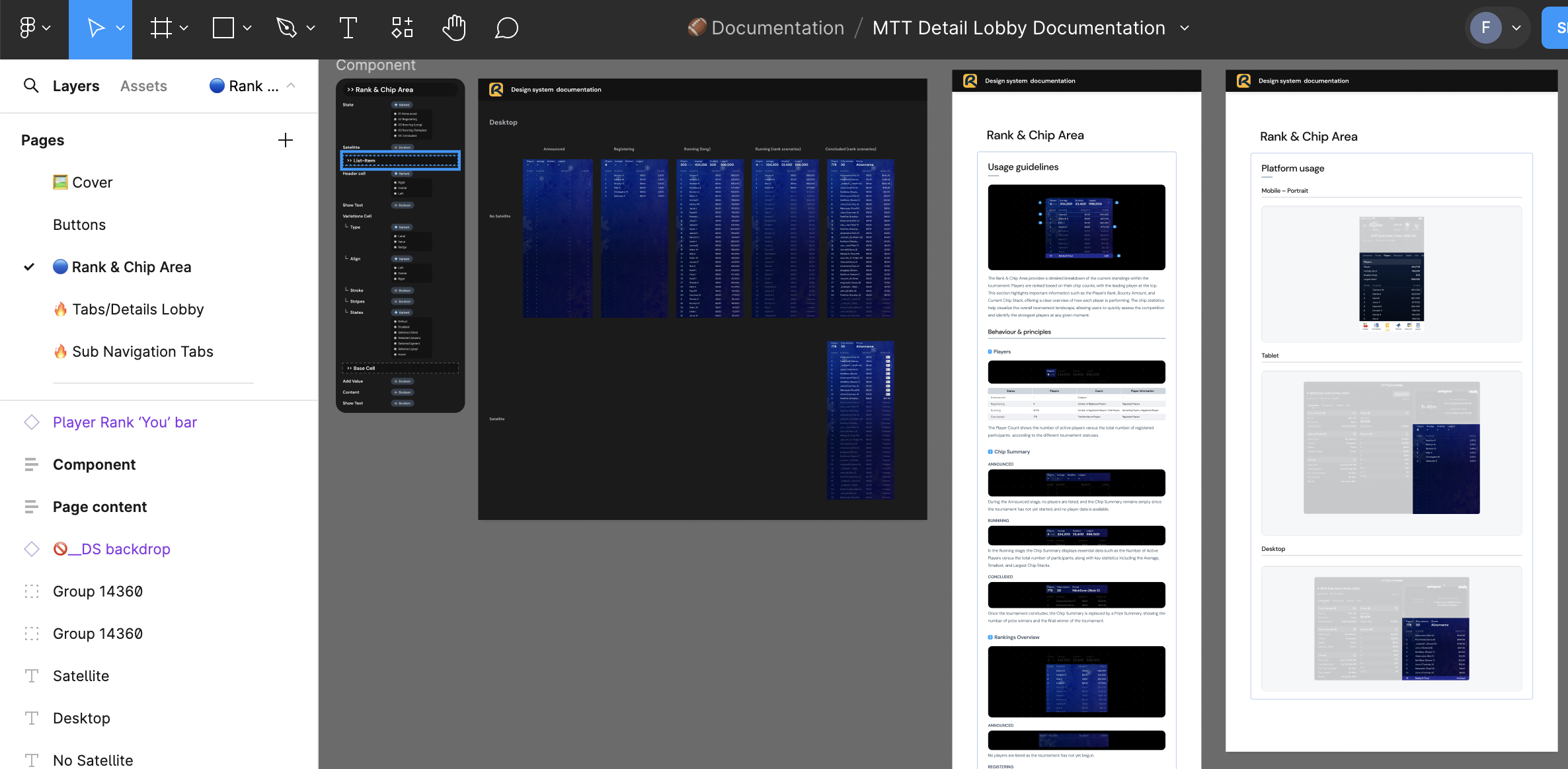
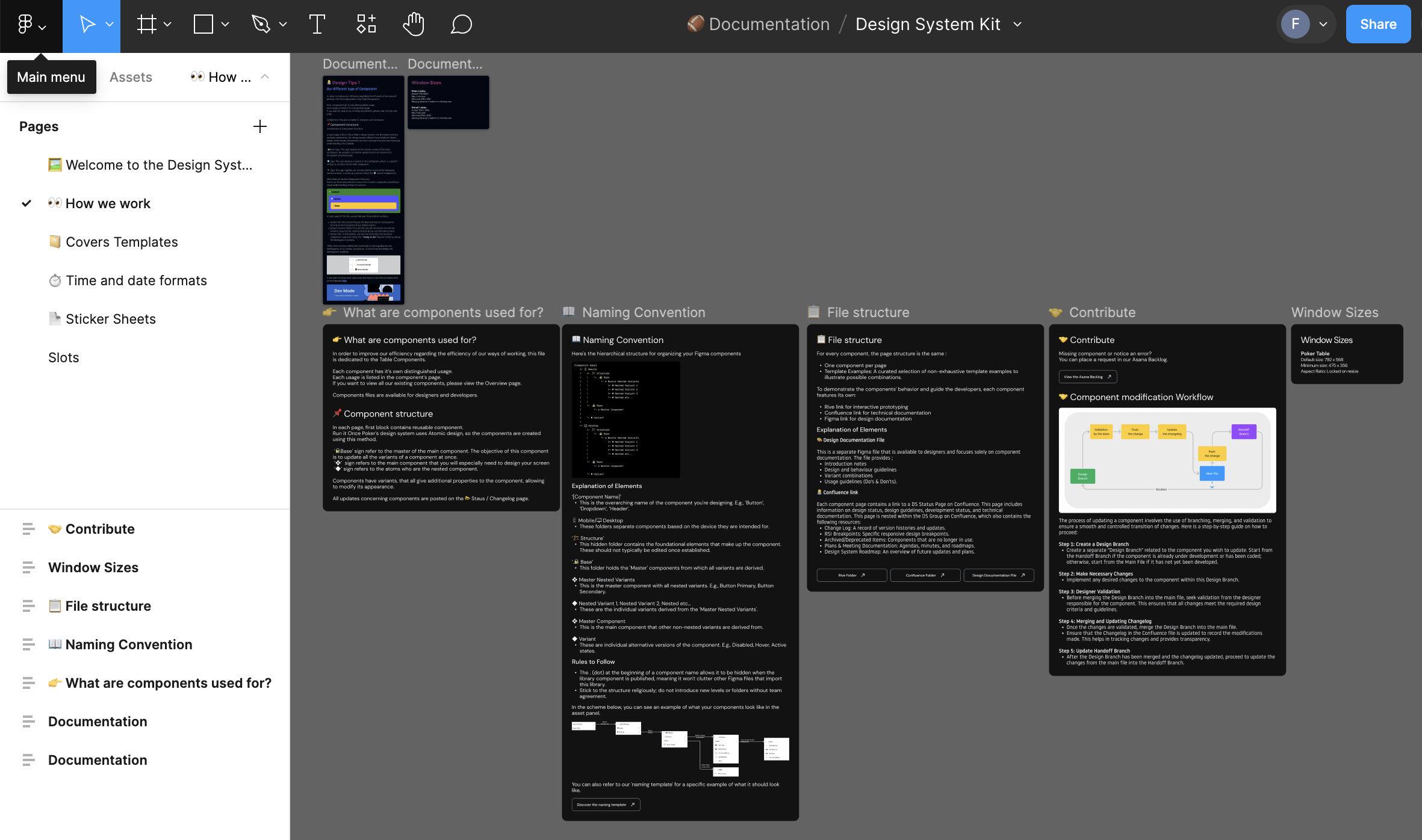
📁 Design System Kit
This File is dedicated to build our differents legens in our figma and also contain our guidelines, naming conventions, file structure and contribution process.
5. 🧰 Products
This folder provides product designers to build all the necessary interfaces to illustrate the various possible user flows within our product.
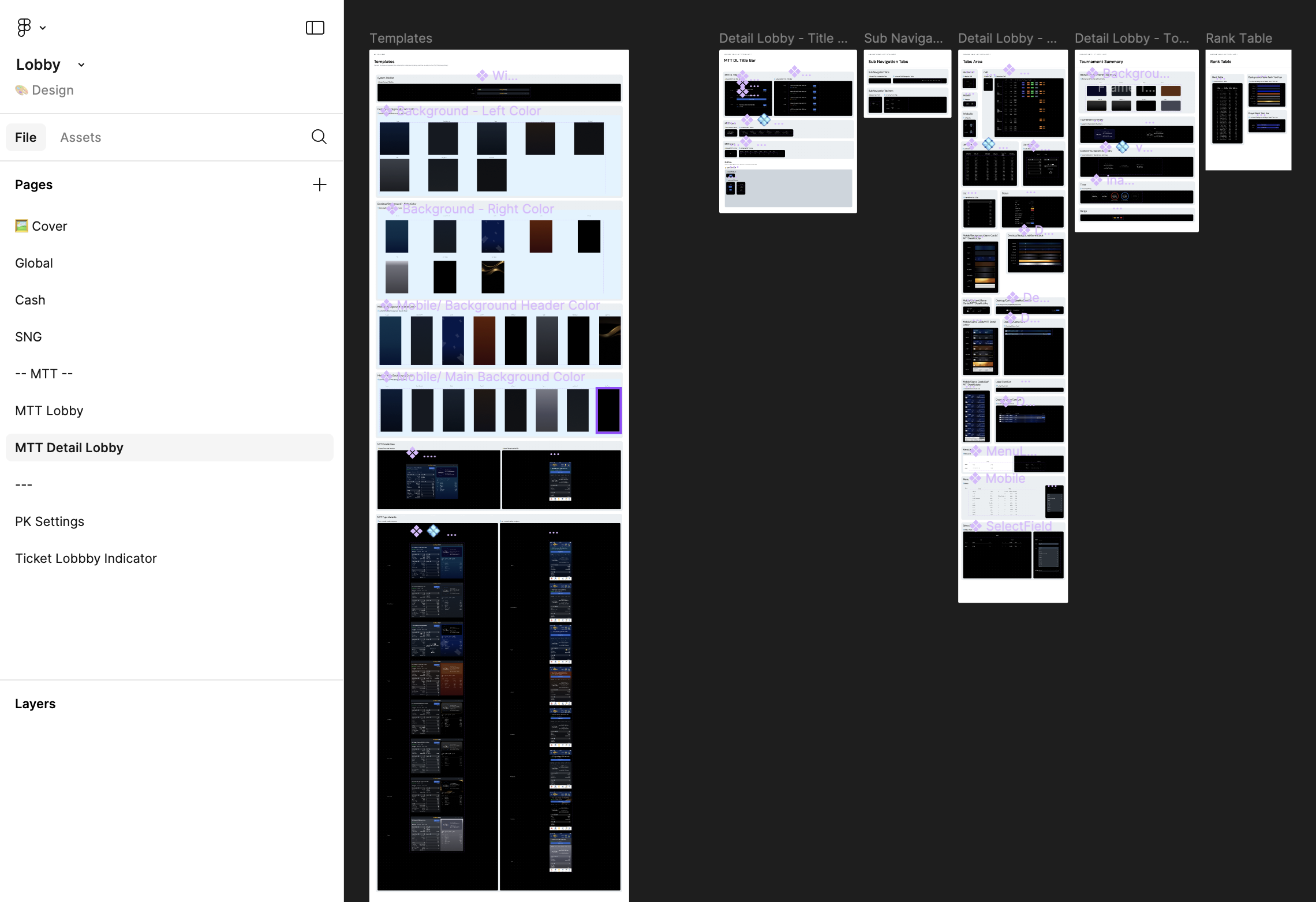
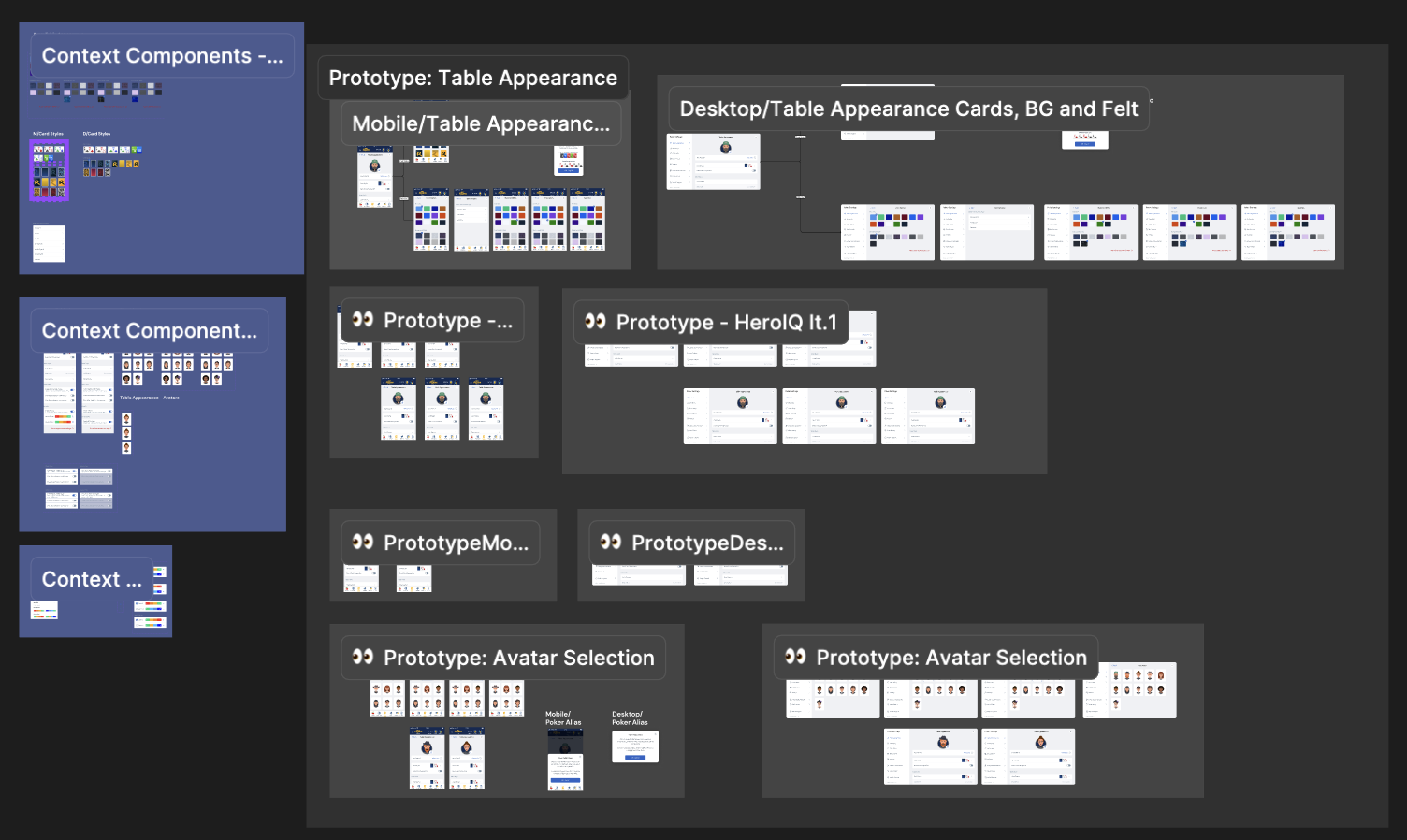
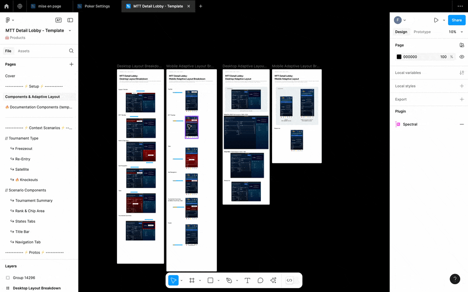
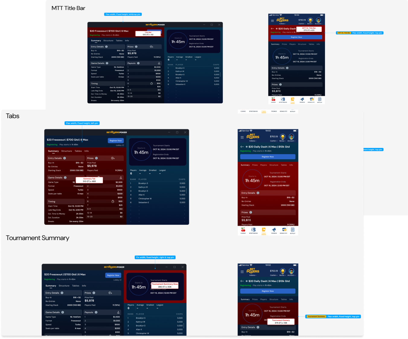
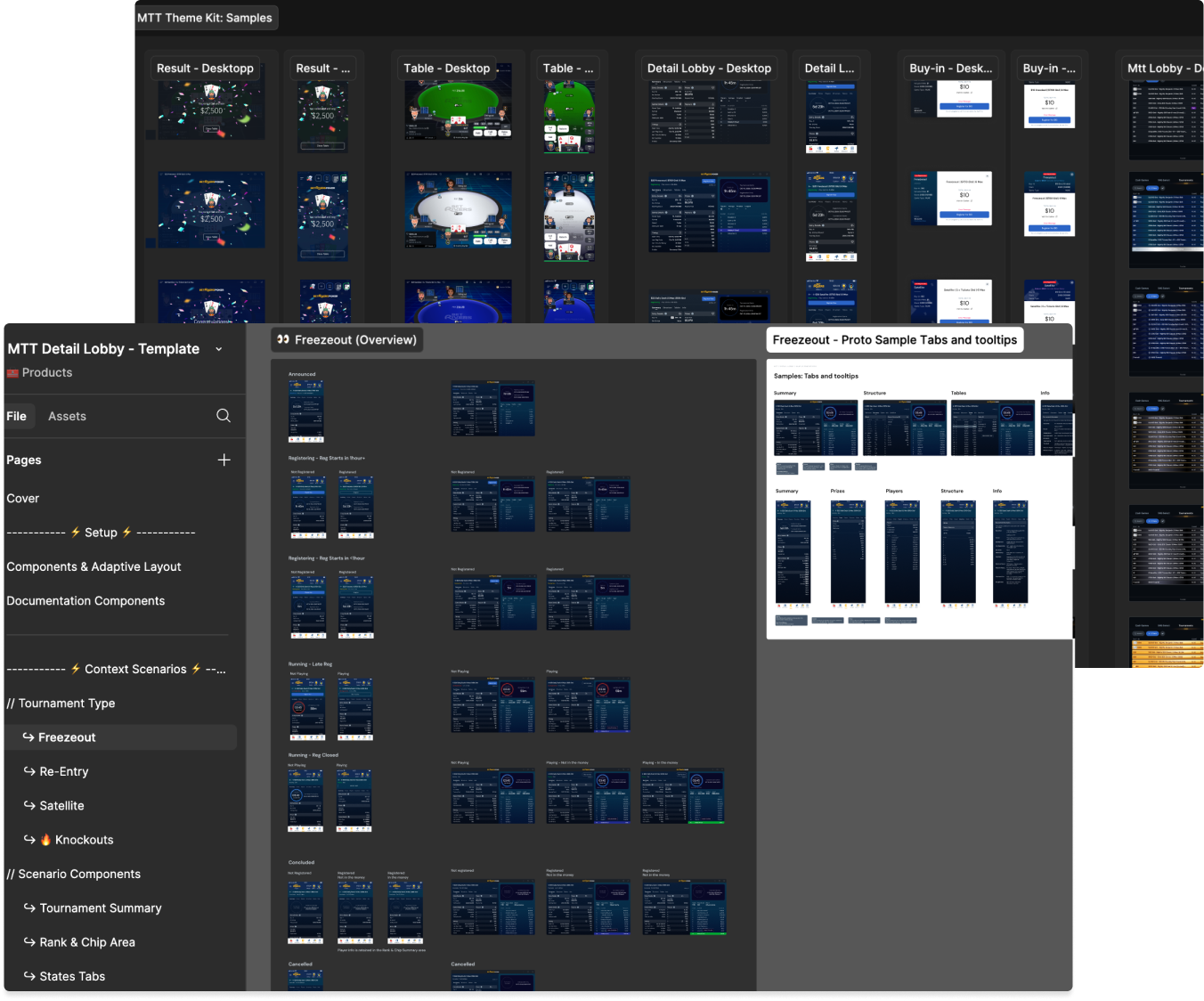
📁 MTT Detail Lobby
This file illustrates all the key elements needed to build the MTT Detail Lobby, one of the most complex parts of our product. It includes contextual components, specifications, mockups, and prototypes.
To achieve this, I introduced the contextual component concept, allowing product designers to create scenario-specific components without modifying the UI Kit’s core components. This ensures consistency while enabling flexibility. As the Design System lead, I can update a component in the UI Kit, and all contextual components will inherit the changes without altering their text or context.
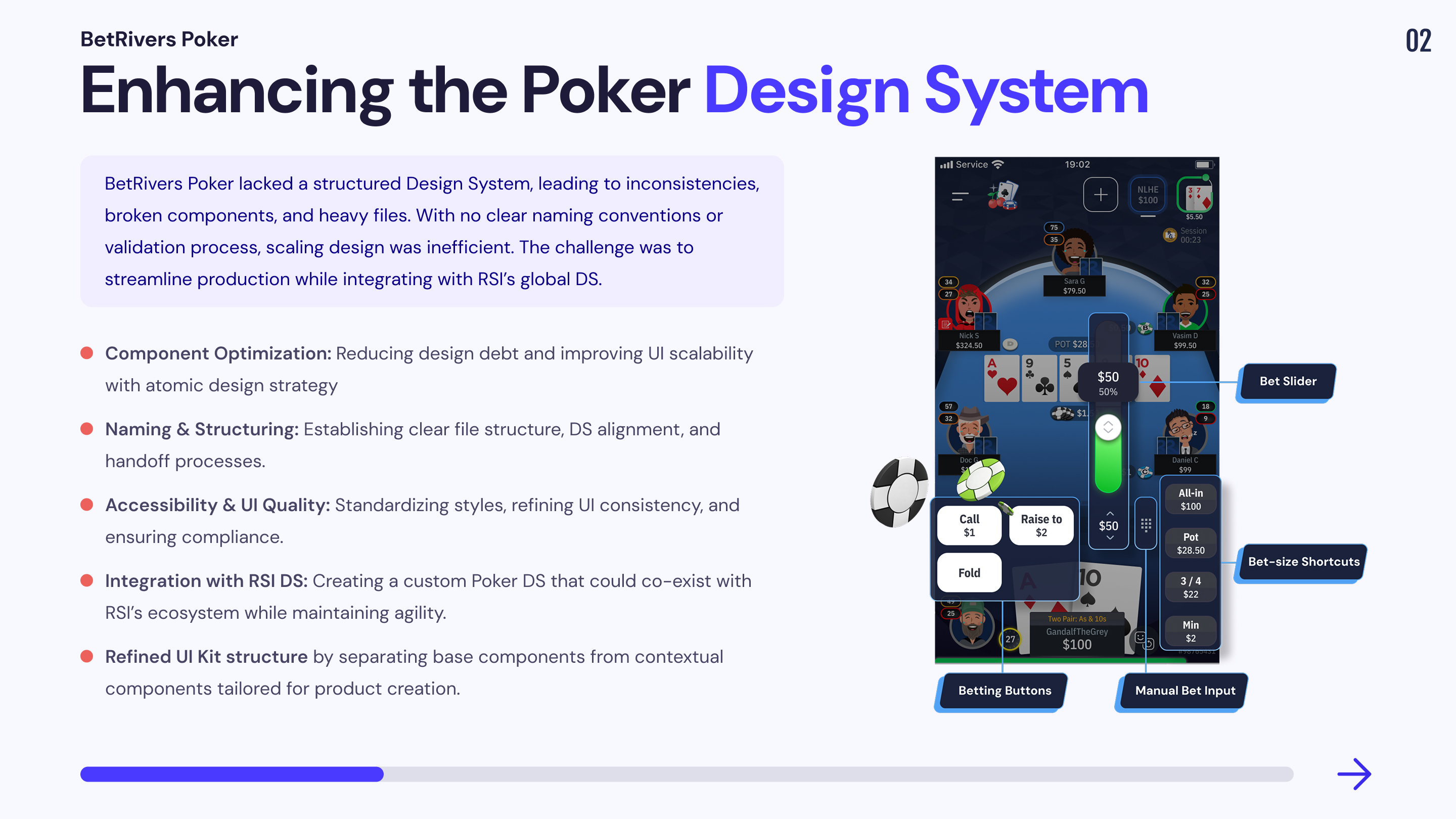
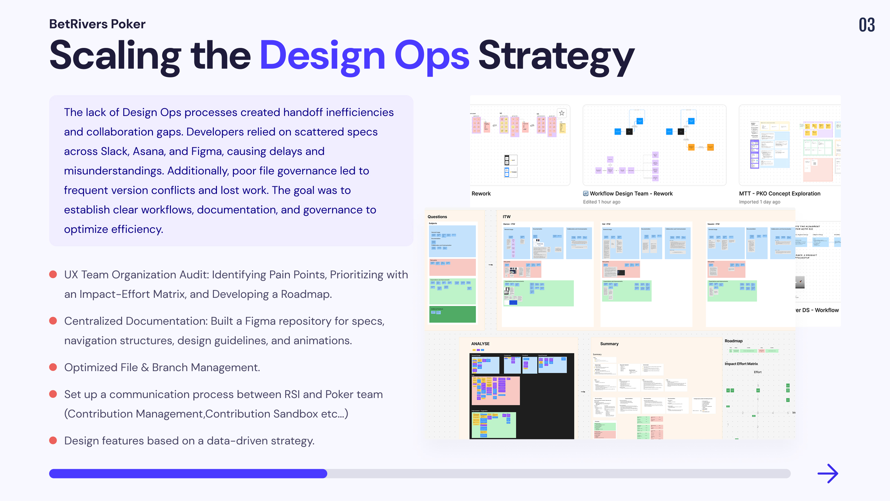
Scaling & Structuring BetRivers Poker’s Design System

As BetRivers Poker evolved, the lack of a structured Design System (DS) created inefficiencies, inconsistencies, and a slow production workflow. Unlike other RSI products (Casino & Sportsbook), which were linked to the RSI global DS, Poker had to build its own due to unique product needs and the need for faster iteration cycles.
However, this approach created fragmentation, leading to design debt, inefficient handoff processes, and a disorganized workflow. The challenge was to restructure the system, ensure better DS governance, and optimize collaboration with RSI while maintaining Poker’s independence and production speed.
🔍 My Design Ops Discovery Process
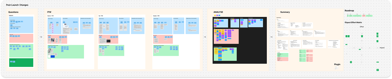
| 1️⃣ Interviews & Team Insights | 2️⃣ Current State Audit | 3️⃣ Pain Point & Impact Analysis | 4️⃣ Impact-Effort Matrix & Roadmap Definition |
| I conducted one-on-one interviews with each designer to understand how they document, collaborate, and manage their design files. This allowed me to gather first-hand pain points and expectations. | I analyzed existing Figma files, documentation, and workflows to map out design debt, file structure issues, and collaboration gaps. | Using the insights from the audit, I categorized issues based on design debt, documentation gaps, handoff inefficiencies, and collaboration bottlenecks. | I mapped all findings into a prioritization framework to balance high-impact improvements with effort required. From there, I defined a clear roadmap to systematically tackle design inefficiencies while ensuring smooth adoption by the team. |
This structured approach ensured that every improvement was data-driven, prioritized for impact, and tailored to the team’s real needs.
1. Reducing Design Debt & Structuring the UI Kit
📔 Context
The UI Kit was not properly structured, leading to:
🚨 Problem & Consequences
💊 Solution
2. Handoff & Documentation Inefficiencies
📔 Context
There was no structured process for documentation, and handoff was inefficient:
🚨 Problem & Consequences
💊 Solution
3. Broken Collaboration with RSI & Poker’s Isolation
📔 Context
🚨 Problem & Consequences
💊 Solution
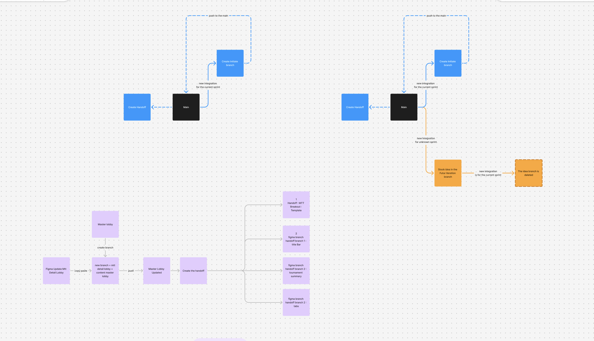
4. File & Branching Organization Issues
📔 Context
🚨 Problem & Consequences
💊 Solution
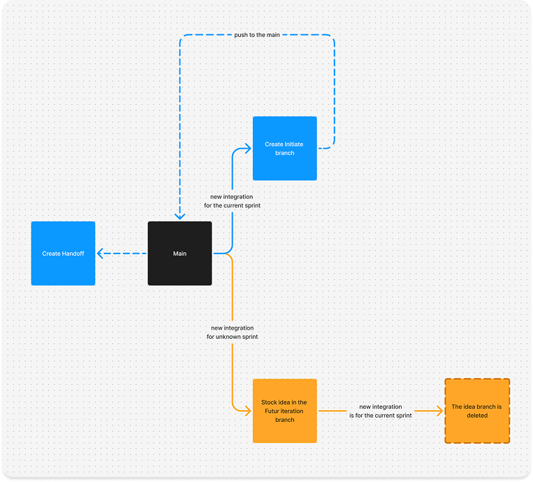
✔ Governance Rule → One designer per component page update per sprint.
✔ Branching Guidelines → Clear separation process between current production, upcoming features, and exploratory design.
5. Lack of Accessibility & UX Tracking
📔 Context
🚨 Problem & Consequences
💊 Solution
By structuring the UI Kit, optimizing handoff, improving collaboration, and implementing clear file governance, the BetRivers Poker team significantly improved design efficiency and product quality. These changes not only enhanced production speed but also reduced technical debt, ensuring a more scalable and maintainable design system.
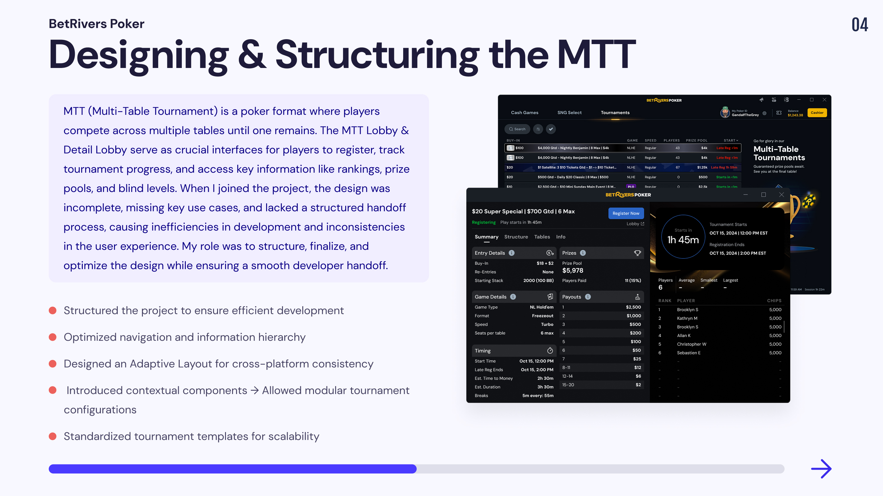
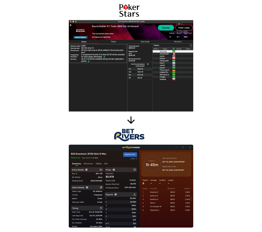
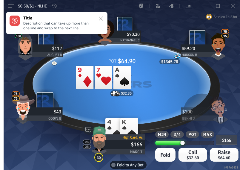
Mission 2 : Designing & Structuring the MTT & Detail Lobby
When I joined the MTT Lobby & Detail Lobby project, an initial version of the designs already existed, but nothing had been developed yet. My role was to structure, finalize, and optimize the user experience while ensuring an efficient handoff with developers to accelerate production.
A major challenge
1. An Incomplete Design That Required Continuous Adjustments
📔 Context
When I joined the MTT Lobby & Detail Lobby project, some initial designs had been created, but they were not finalized. Many use cases had not been anticipated, leading to inconsistencies and gaps during development.
🚨 Problem
💊 Solution
2. No Structured Handoff, Leading to Development Issues
📔 Context
The project lacked a structured handoff process between the design and tech teams. This resulted in constant back-and-forth, significant time loss, and misinterpretations during development.
🚨 Problem
💊 Solution
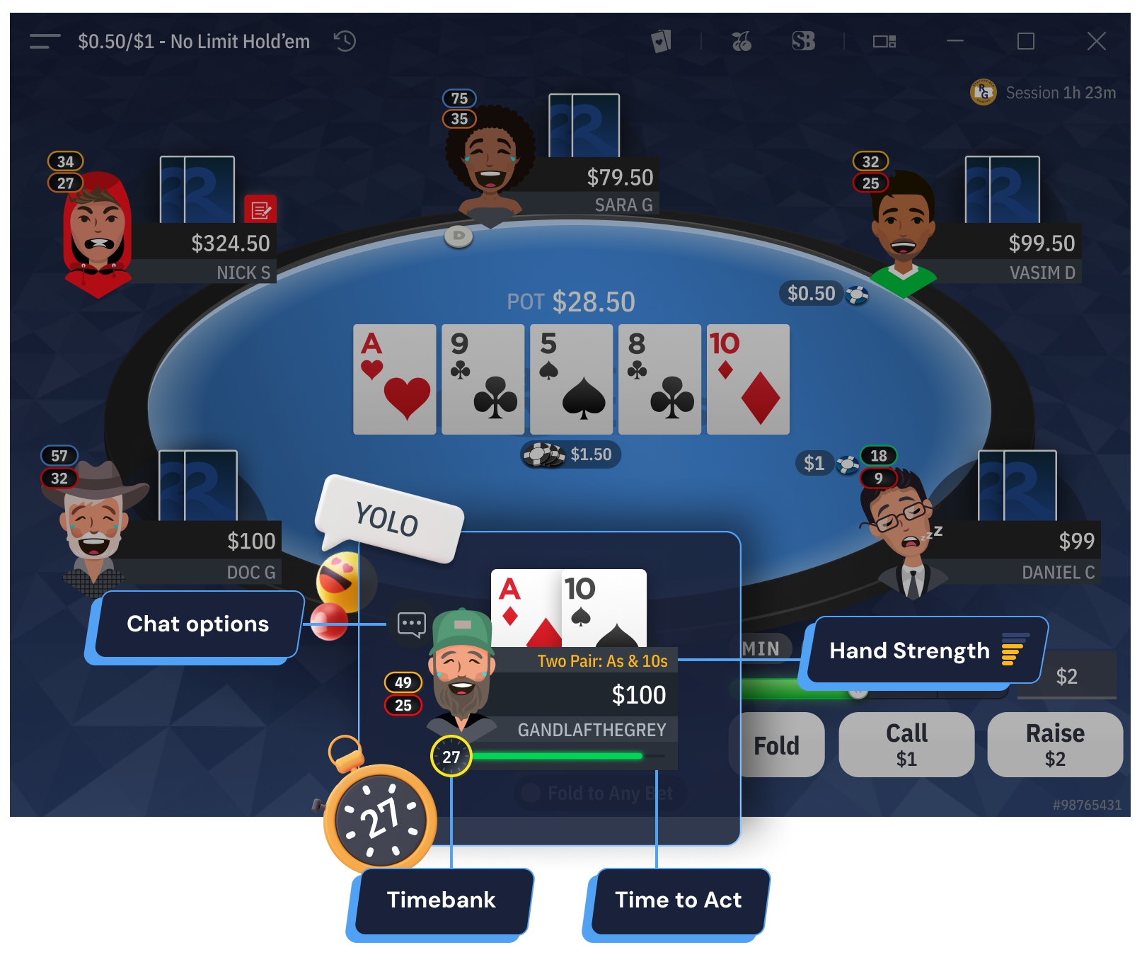
3. Poor Information Hierarchy
📔 Context
Critical information for players (rankings, buy-ins, blinds levels, etc.) was poorly structured, making the interface difficult to navigate and interpret.
🚨 Problem
💊 Solution
4. Ensuring Adaptability Between Desktop & Mobile
📔 Context
The project needed to be fully responsive, but no clear adaptation logic had been defined before my involvement.
🚨 Problem
💊 Solution
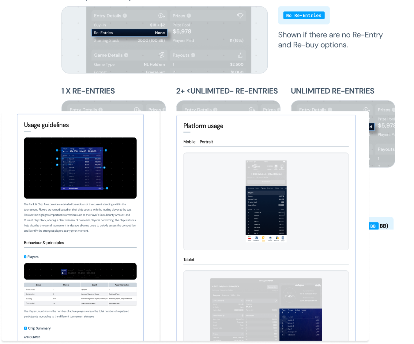
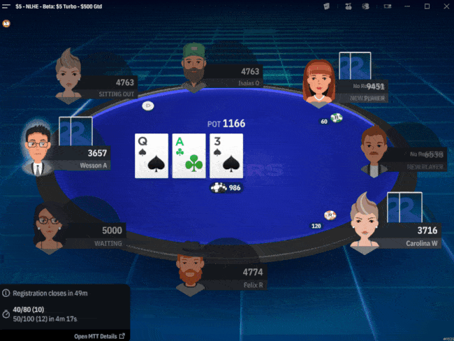
5. Managing Multiple Tournament Types
📔 Context
The MTT tournaments included multiple formats (Freezeout, Knockouts, Satellite, Re-Entry etc…), but there was no standardized template to efficiently structure them.
🚨 Problem
💊 Solution
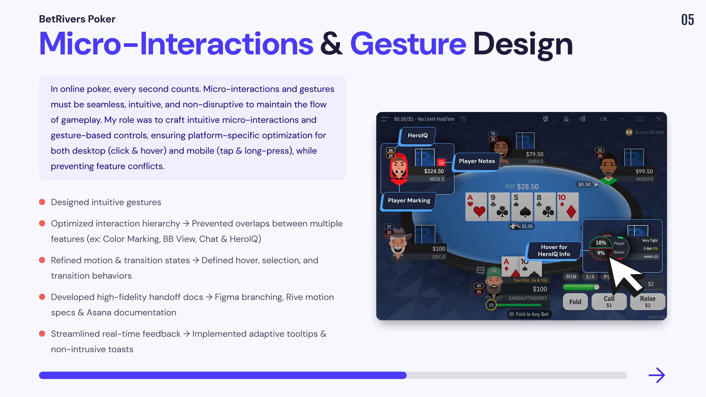
Mission 3 : Enhancing User Engagement with Micro-Interactions & Gesture Design
In an online poker experience, every second matters. Micro-interactions and gestures play a crucial role in creating a seamless and intuitive experience for players.
While users expect an interactive and engaging UI, interactions must also be quick, responsive, and non-intrusive to avoid disrupting the core poker experience. The challenge was to design micro-interactions that feel natural, intuitive, and non-distracting while optimizing usability across both desktop and mobile.
Key Interaction Features & Design Solutions
Interaction Design Process & Implementation Strategy
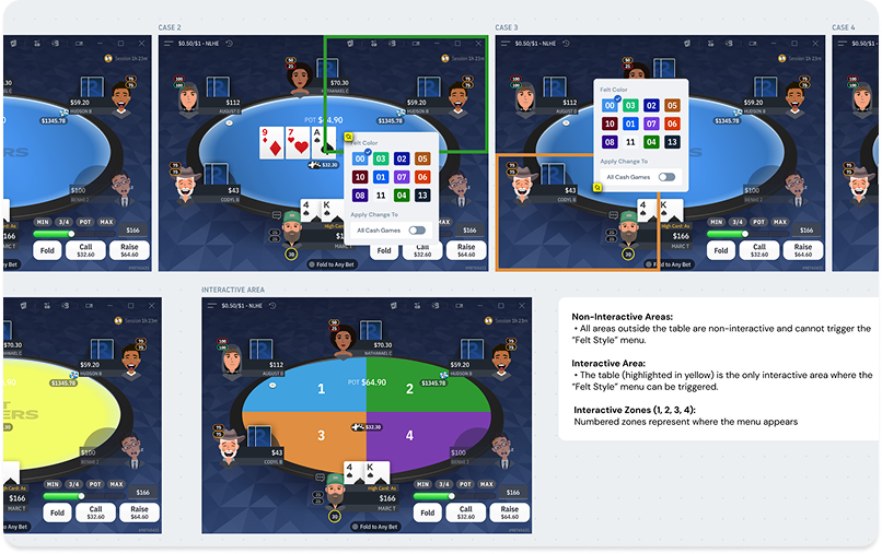
1. On-Table Themes & Customization
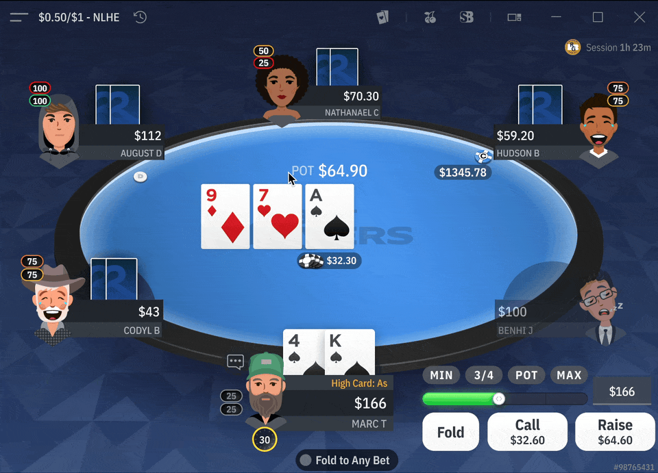
🎨 Allowing users to personalize their poker experience while preserving game clarity.
📔 Context
🚨 Problem
💊 Solution
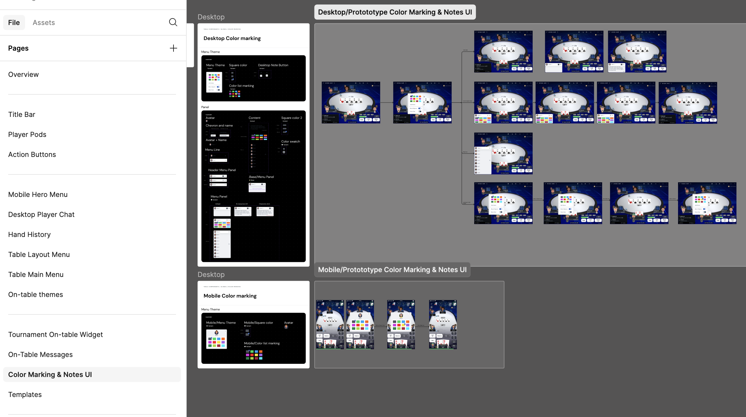
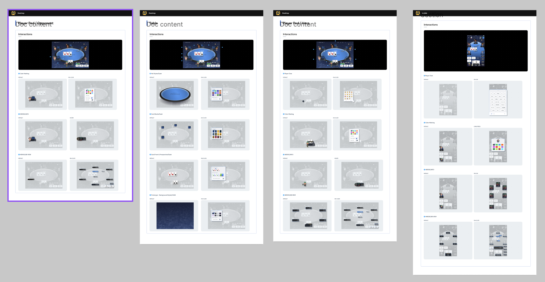
2. Color Marking & Notes UI
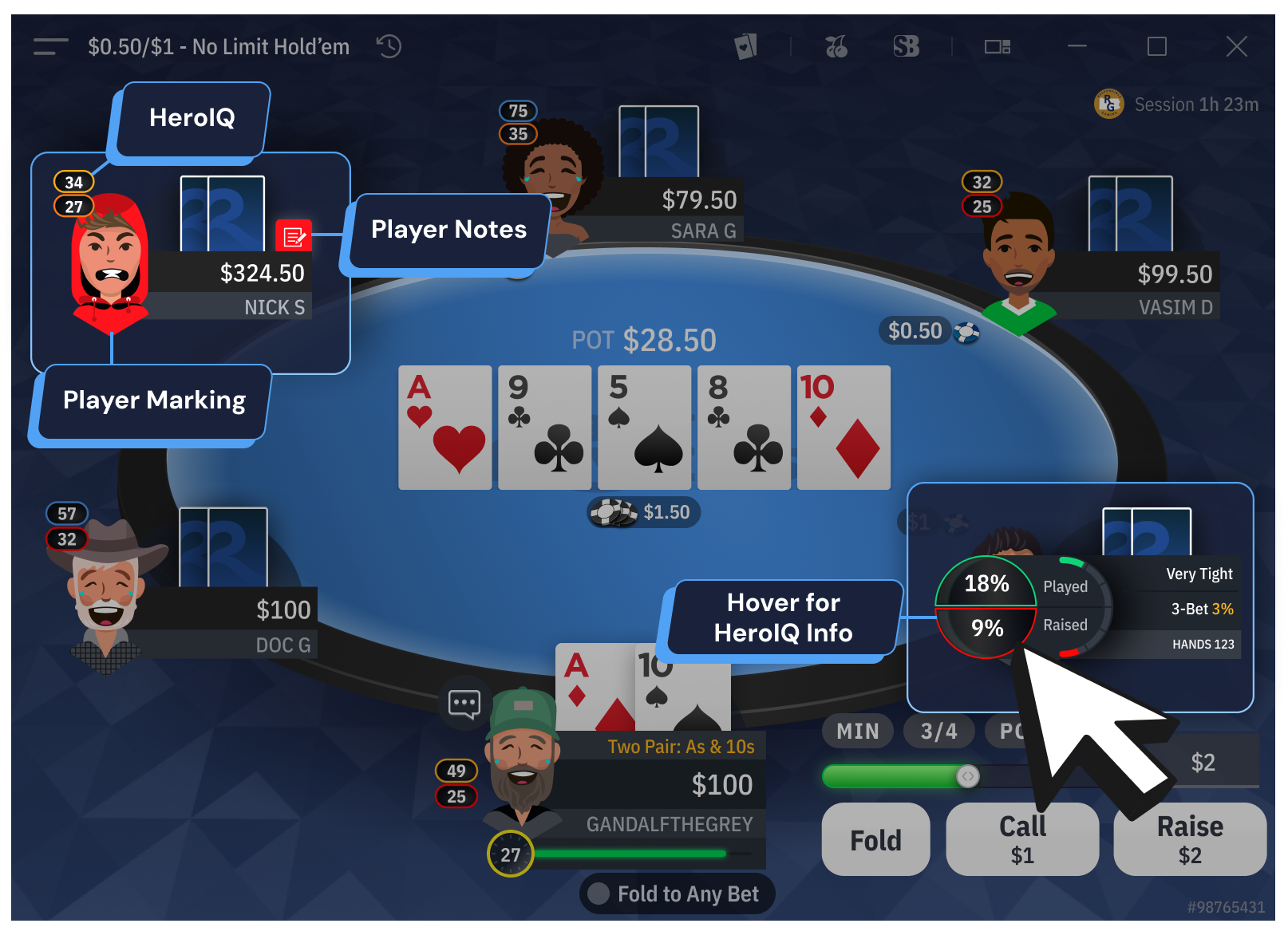
🕹️ Helping players track opponents without interfering with in-game interactions.
📔 Context
Poker players need to mark opponents (e.g., aggressive, passive) and take quick notes during gameplay. This feature must be quickly accessible without conflicting with other UI elements.
🚨 Problem
💊 Solution
| Color Marking | BB View | HeroIQ Info | |
| Mobile | Long press on opponent | Tap on Hero’s nameplate | Tap on opponents or Hero |
| Desktop | Right-click on opponent avatar | Right-click on Hero or opponent nameplate | Hover over opponents or Hero |
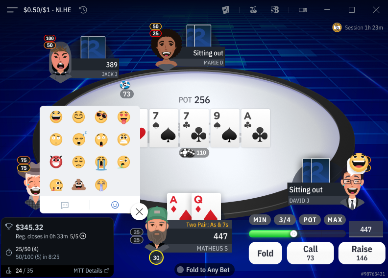
3. Player Chat & Emoji System
💬 Enhancing the social aspect of poker while maintaining a distraction-free environment.
📔 Context
As it’s also a social game, poker players are used to interacting with quick reactions during gameplay.
🚨 Problem
💊 Solution
4. Tooltips & Toasts (UX Feedback Mechanisms)
🤖 Providing real-time feedback without cluttering the interface.
📔 Context
Poker relies on real-time decisions. Players need instant feedback (e.g., successful actions, errors) without being overwhelmed.
🚨 Problem
💊 Solution
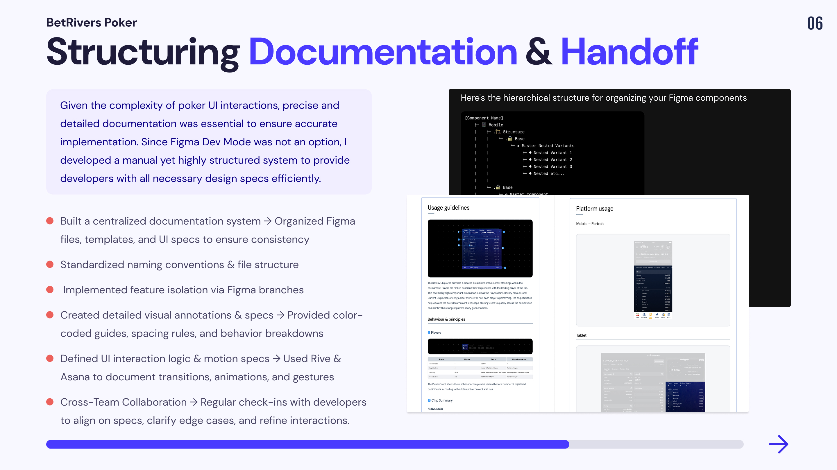
Mission 4: Documentation & Handoff process
As a Senior Product Designer, I was responsible for structuring the documentation and handoff process to streamline collaboration between designers and developers. Given the complexity of poker interfaces and the need for precise UI specifications, a clear and scalable process was critical to ensure smooth implementation.
Main Challenge
Given these constraints, a structured approach was necessary to ensure that the handoff process remained efficient, scalable, and error-free.
Structuring the Documentation for Clarity & Efficiency
📔 Context
To make UI specifications clear and actionable, I implemented a systematic approach to documentation, ensuring that every component, feature, and interaction had a dedicated reference.
🚨 Problem
💊 Solution
Implementing an Effective Handoff Process
📔 Context
Since Figma Dev Mode was not an option, a manual but highly detailed handoff approach was required to provide developers with precise specifications.
🚨 Problem
💊 Solution
Key Result
Outcomes
Process constraints